This was a partnered project back in the fall for my typography class. The assignment was to pick a magazine, and create our own booklet analyzing the typography, grid system, photography and other elements that are used to make each magazine unique and special. We choose the British publication "Monocle". It proved to be a big challenge as they tended to never stick to any initially apparent concrete rules across or within publications. Still, this project was loads of fun to work on and was very insightful for me. It could not of been done without the help of my partner, Ben Markoch, please take a look at his amazing work as well! * http://benmarkoch.com/ *

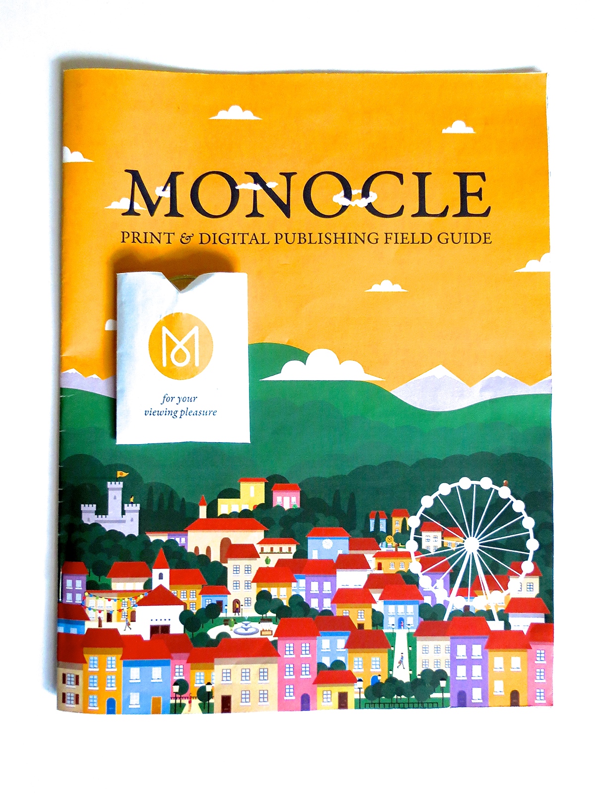
For our cover we decided on going for a highly illustrative style, that kept with the flat, clean illustrations that exist within "Monocle".


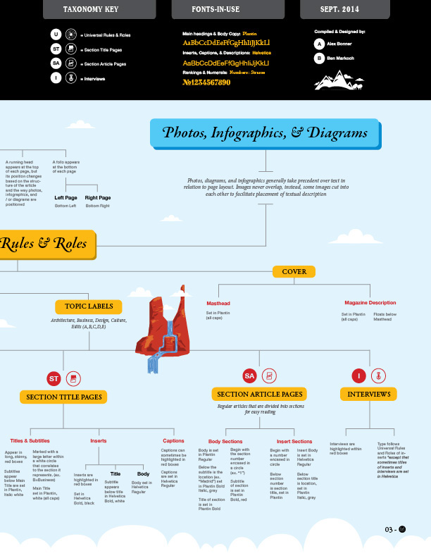
The first analysis was to create a map that literally spelled out all of the typographical rules and roles that existed within the publication. Throughout the publication we returned to the black and yellow color scheme of Monocle, and played off of their red iconography system.


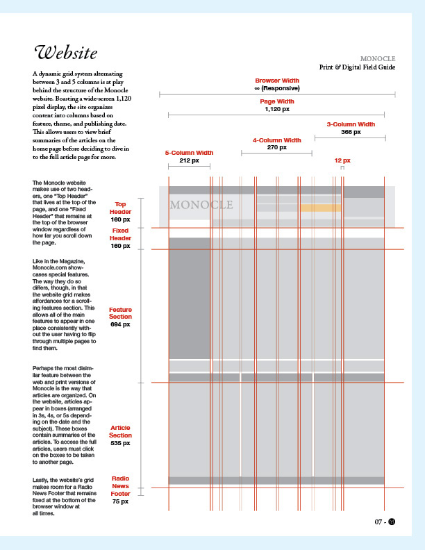
In addition to having a print publication, "Monocle" also has a website with it's own system. While there are some similarities, web and digital layouts tend to be quite different. As such we also diseccted the elements of their website. Fun fact, they also have their own clothes line, podcasts, cafe, and perfume. These are busy people.


Thank you for taking a look!
Again, please check out the ever so talented Ben Markoch: http://benmarkoch.com/

